“going to meet trump” lol
Screenshots from Stormy Daniels’ phone.
The transparent one looks very bad compared to the other two options IMO
Is it removable? I HATE having it on screen and not being removable.
It’s great if someone likes it, but I HATE it and that persistent Google Search Bar at the bottom.
It’s a widget so yes. …and the search bar is part of the launcher where you’re free to use any launcher you want
It wasn’t removable previously. I’ve had to install launchers to get rid of it.
the search bar is part of the launcher
Yes. And it’s dumb. Also, if I have to install a separate launcher to customise the Homescreen for such basic shit, then it’s a bad idea.
Note: this is all anger directed towards Google. Not you personally.
You’re presumably talking about the Pixel Launcher widget, which isn’t removable (you can disable it but you don’t get the space back).
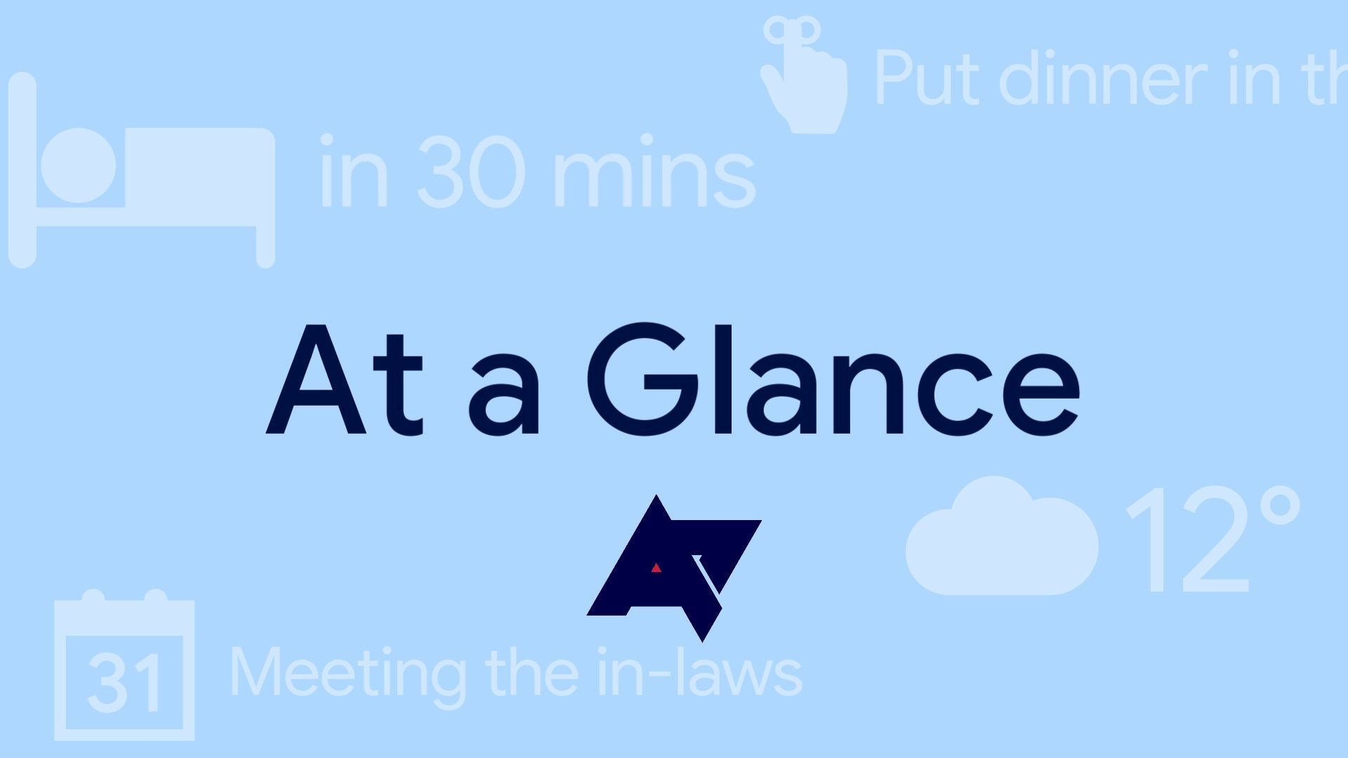
This article is about the widget that non-Pixel phones can install, which will behave more like a standard widget as it can work on any launcher or device.
How did I go through the entire article and not actually read “non-pixel” 😭?
I’m so sorry guys.
Easily done.
(you can disable it but you don’t get the space back)
This can certainly be annoying. But if you think about it from a UX perspective, what would happen if you could?
What happens if you disable it, use the space, and then enable it again?
Where does everything go that you placed there?
Does it just shift down? What if it can’t because of other content on the page? Do you just shift it to a new page? What if there is content in the way across multiple pages? Does that all get shifted to a jumbled mess on a new page?
What if you just didn’t let the user enable it again unless the space was cleared? Would that be too confusing for less capable users?
Sometimes UX designers do seemingly dumb things for very smart reasons.


