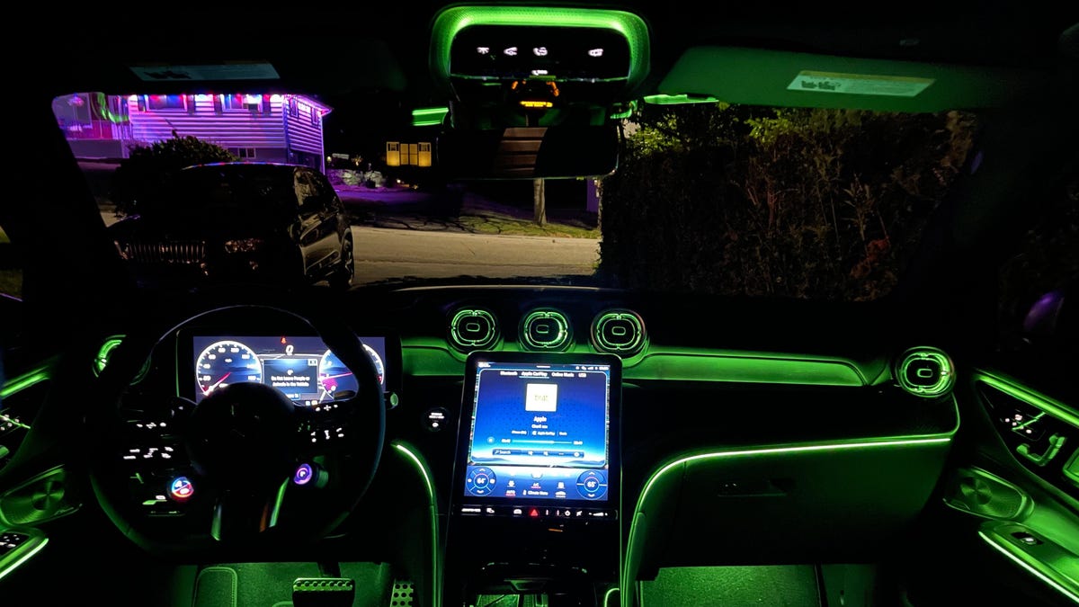
It turns out that more technology in cars isn’t necessarily something customers want, and it’s not really improving their driving experience. We know my thoughts on the matter, but I’ll do my best to stay impartial on this latest survey from JD Power that shows most customers don’t appreciate technology in cars unless they can see a clear benefit to them.
JD Power’s 2024 U.S. Tech Experience Index Study evaluated over 81,000 drivers’ experience with “advanced vehicle technologies” in 2024 model year vehicles after 90 days of ownership, It turned out to be a pretty mixed bag when it came to what people liked using. There are a number of tech features that customers like using because they feels that it answers their needs, but at the same time there is a whole lot that don’t get used very often or are continually annoying, according to the survey.
…


I drive an EV for work, any my biggest gripe is the touchscreen. What is wrong with buttons. Why must everything be hidden behind a menu I have to navigate on a touchscreen. It feels less safe, frankly. In my own car I have muscle memory for each button and can do things like skip songs or adjust the AC without looking away from the road… But in the EV I can’t.
Why? Because it’s a looot cheaper to produce.
Mhmm. Fewer moving pieces, fewer under warranty repairs. Also simplifies production, just need to screw in a screen.
And you only need to produce one screen and just re-skin the UI for your other product lines
And charge people for over the air software unlocking of features that are already part of the car but they “didn’t pay for” when they bought it.
I wish they’d do exactly what they’re doing now, but add a series of generic physical buttons along the bottom that can be remapped as quick buttons that either the OEM or end user can map to specific features.
E.g. A/C controls, skipping songs, opening apps or whatever.
My car does it pretty well. It’s got a touch screen, but it also has a knob and two buttons that I can use instead of the touch screen.
Also there’s no need to design a new user experience for each model of car - things like designing buttons and a button layout that fits in with the overall interior design of the car. Just use a touchscreen and reskin the same UI.
What does being an EV have to do with anything? ICE cars are exactly the same.
I totally agree with you though. Tech and UI in modern cars is pretty awful.
I would say eve typically do have more controls on touchscreens vs buttons. Now this issue is mainly observed in Teslas more than any other car, but Teslas are the most popular ev so ya it’s definitely more of a problem on evs.