Random recommendation, but I recently stumbled upon https://monaspace.githubnext.com, and it seems like a pretty cool approach to the whole “monospace font for dev work”
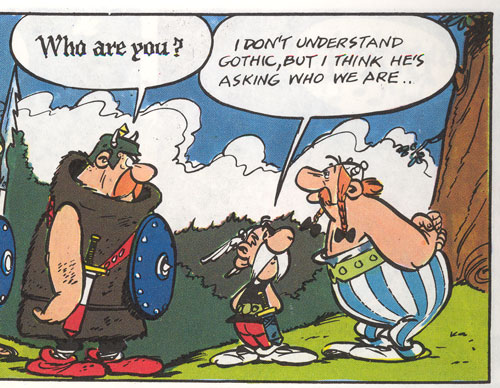
I like that idea of using the different fonts for e.g. Copilot suggestions - reminds me of reading Asterix comics as a kid when they’d use gothic black for the Goth’s speech, etc.
The idea of the github fonts is interesting, but I find it strange that the same letters next to each other can have different widths. I currently prefer the CommitMono approach.
That’s actually very much my kind of font, thanks a lot. At first glace I still prefer my current font (Liberation Mono), but I’ll give it a test run and see how it feels after a couple of weeks. You can never tell right away if a font is a keeper.
Random recommendation, but I recently stumbled upon https://monaspace.githubnext.com, and it seems like a pretty cool approach to the whole “monospace font for dev work”
I like that idea of using the different fonts for e.g. Copilot suggestions - reminds me of reading Asterix comics as a kid when they’d use gothic black for the Goth’s speech, etc.
edit: e.g.

I remember these when they came out, and I liked Neon and Krypton the most. I’m glad you linked it so others might get to see it though, thanks!
The idea of the github fonts is interesting, but I find it strange that the same letters next to each other can have different widths. I currently prefer the CommitMono approach.
That’s actually very much my kind of font, thanks a lot. At first glace I still prefer my current font (Liberation Mono), but I’ll give it a test run and see how it feels after a couple of weeks. You can never tell right away if a font is a keeper.
Looks great, thanks for sharing