- A beautiful updated logo!
- Brand new “My Home Assistant” buttons
- New tile card features for climate entities
- Tile card feature for Select entities
- Password managers and Home Assistant
- Map entity marker options
I’ve given it some time, but I just don’t like the new logo. I don’t really understand the need to make it so simple that it no longer really resembles anything.
I would understand if they had only simplified the neural part of the logo for the sake of simplicity and scalability. I really liked the shape of the house tho because it did resemble a real house. The new shape looks just like a wierd toy block.
I know it’s different, but if I wouldn’t know home assistant I could have assumed it had something to do with USB
True, now that you point it out it gets even worse lol
The new logo is pain hideous. It feels like done weird parody of Homeassistant.
deleted by creator
I’m not a fan of the new logo.
And doesn’t go well with circular layout. Looks like a droplet.
When will they update the companion app icons with the new logo?
I hope never. It is enough I have to see that thing when the app starts. If it shows in my phone app drawer, I’m doing a custom icon with the old logo. Bleh, that thing is sooo ugly.
It just updated on my phone to the new icon. I tried to give it a chance but wow that looks not great. Something about the scale and lack of discerning features.
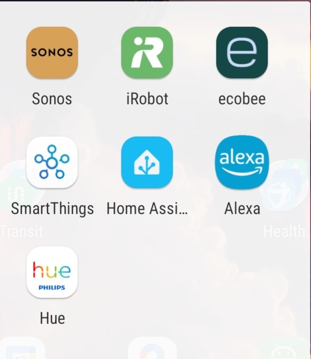
If you are on iPhone, apparently you have the option to choose between new and old logos
Probably still no user accounts so I can give people control over only their own rooms and shared areas.
There are user accounts and you can restrict dashboards on a per user basis, but it’s clunky currently and could do with being expanded.
These limitations should not be misconstrued as security. Anyone with an account can still interact with any device in any way accepted by HA. And just because they can’t see them on the dashboard doesn’t mean they can’t see them through various other methods.
deleted by creator
Yay, WeatherFlow Tempest was added!
Oh no, now I have to redo all my automations and NodeRED stuff lol
WeatherFlow Tempest
Nice, I’ve been looking for a local weather station and had not seen this one. Shame the price triples by the time it gets over here, but at least it’s available (contrary to most other options I’ve found). Might go for it anyways…
Install of this fails for me. Hope you have better luck.
