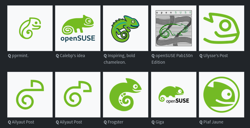
The openSUSE community’s logo contest submission phase is now complete and voting for the logos has begun.
This competition marks a pivotal moment for openSUSE and the voting goes until Dec. 10.
Before making any selections, people are encouraged to visit en.opensuse.org/Logocontest and view the logos before voting.
The number of submissions speaks volumes about the community’s enthusiasm and engagement with 18 submissions for Kalpa, 24 submissions for Slowroll, 21 submissions for Leap, 32 submissions for Tumbleweed and an impressive 36 submissions for a potential new openSUSE logo.


In my opinion one of the full design themes should be picked because some of those single designs look very nice individually but would clash with others.
My pick would be Emiliano’s theme, it looks the most like an evolution of the opensuse style. Imo the others are either a bit too minimalist or deviate too strongly from the original design.
Nikolayan’s design is also good, but I prefer Emiliano’s because that you can recognise the chameleon better in every logo.
I like this one
It is a friendly recognizable chameleon and they did a good job with integrating the existing abstract logos.
From the Solo designs I loved the ones with the branch with different endings a lot. It had a warm touch to it, but was a little to filigrane for a logo.
Kinda looks like an embryo to me.
I can’t help but see a squirrel!
That one is my favourite. Cute chameleon (or was it gecko), but also simple. Looks great
Always has been a chameleon. It was named Geeko, which generated some confusion.